Find the colours you did not choose
Your balcony already has a palette. The floor, railing, building wall, furniture and view all contribute, even if you did not select them. Begin by listing these fixed colours and their character: warm or cool, light or dark, quiet or emphatic. A new decorative palette needs to work alongside those facts rather than pretending the space is an empty canvas.
Include your plants. Olive leaves, glossy dark foliage, dry seed heads and fresh growth do not behave as one uniform green. Their surfaces catch light differently and change through the year. Let an existing leaf tone act as a bridge between the built setting and your chosen objects. This often reduces the number of additional colours you need.
Write a sentence before selecting swatches
Try describing the atmosphere in plain language: “warm clay against a deep background, with pale handmade details,” or “a quiet mineral setting interrupted by one vivid painted gesture.” This sentence is a useful filter. It tells you what the palette is doing, not merely which colours happen to appeal when seen separately.
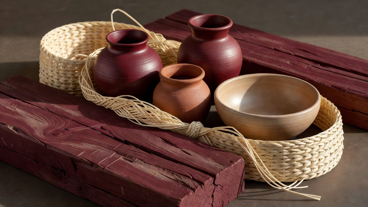
Then choose a grounding colour, a supporting material tone and a smaller accent. These are roles, not mandatory proportions. A burgundy wall might ground the whole composition, terracotta vessels might provide warmth, and champagne might appear only in a rim and a textile edge. If the fixed wall is already pale, you may reverse the relationship and keep burgundy as the smaller note.
Study relationships rather than isolated favourites
Josef Albers’s Interaction of Color is a useful reminder that the appearance of a colour depends on its neighbours. Johannes Itten’s The Art of Color offers another route into contrast and harmony. You do not need to adopt a complete colour theory system to use the practical lesson: compare samples together, in the place where they will live.
The weaving and material studies of Anni Albers offer a further prompt: colour arrives through texture as well as pigment. A matte clay surface, glossy glaze and open woven fibre can share a warm family while reflecting light very differently. That difference gives a restrained palette depth without requiring more hues.
Test under the light you actually have
Gather physical samples where possible: a painted board, a fabric cutting, a small tile or the actual pot. Look at them in morning light, midday brightness and evening shade. A sheltered balcony can receive reflected light from neighbouring walls, while a pale floor may bounce warmth onto the underside of leaves and furniture.
Check from inside as well as outside. The balcony is often seen through glazing and framed by an interior room. A colour that feels convincing outdoors may fight with the room beyond the doorway. You do not need identical indoor and outdoor schemes, but one repeated material or shared light tone can make the transition feel considered.
Repeat without making everything match
Repetition creates connection when the objects themselves differ. A pale brushed line on a mural can relate to a ceramic rim; the clay body of a planter can echo a woven seat; a dark sculpture can pick up the railing. Allow each object its own surface and shape. Uniform matching can flatten the very handmade character you wanted to celebrate.
Keep the strongest contrast near the place you want the eye to pause. If a mural is the anchor, supporting vessels can have lower contrast. If a sculptural pot is the focus, let its background stay quieter. Distributing equally strong accents across every corner makes the eye keep moving without finding a clear arrival point.
| Choice | Visual effect | Outdoor check |
|---|---|---|
| Dark painted surface | Provides a grounding field for pale details. | Consider solar heat and substrate suitability; dark surfaces can become hot. |
| Pale textile | Adds a light interval between solid objects. | Check exterior rating, cleaning and drying instructions. |
| Expressive glaze | Introduces a concentrated accent. | Colour does not establish frost or UV resistance. |
Edit the palette as the balcony lives
Take an ordinary photograph from the doorway and look at it at a small size. Which colour attracts attention first? Is that the intended focal point? Temporarily remove a cushion or turn a patterned pot so its quieter face is visible. Editing a colour relationship is often easier than replacing an object.
Allow seasonal flowers, fading leaves and changing daylight to make small variations. Keep the permanent framework coherent enough to welcome them. Record paint references and material care instructions for future repairs, but do not demand exact sameness from every handmade surface. A successful palette holds the composition together while still making room for difference.